Huzzah, I made Round 2 of Triple Trouble! Woot! I gotta say, I was really excited and surprised that I got through considering the high quality and creativity of all of the entries. The competition was fierce!
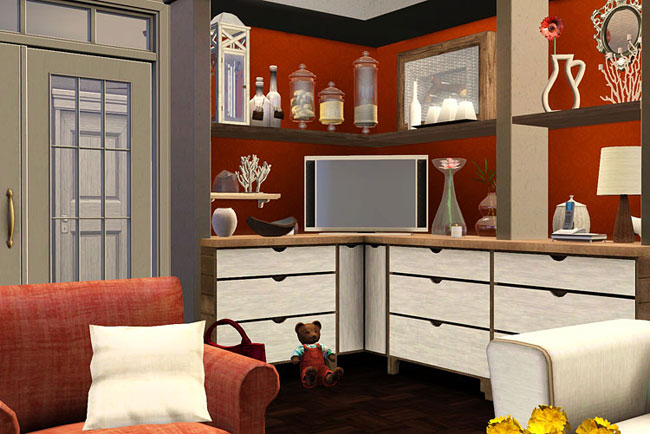
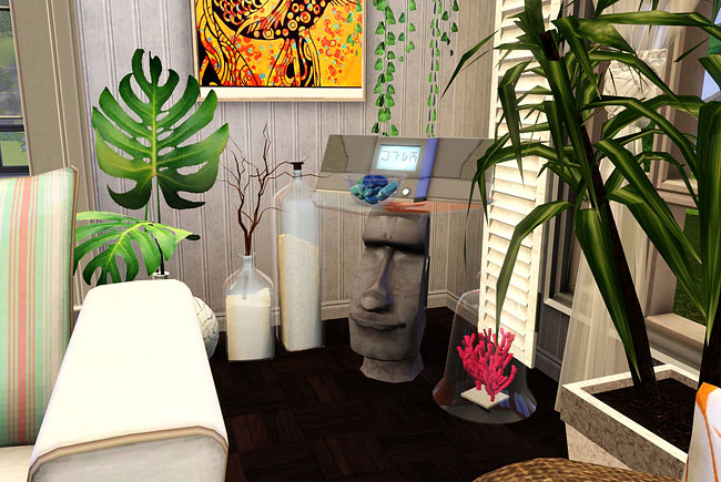
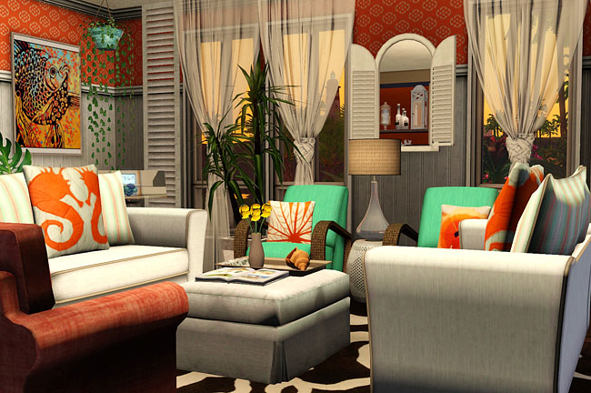
Here are some extra pics from my Round 2 entry, which charged us to decorate the family’s living room in a Coastal style. Since my Stevens family lives by the beach in Sunset Valley with palm trees all around, and one of the sub-styles of Coastal is Tropical, I went with bright coral orange, sea green, pearly white, and some stark white as well. I even got some brown in there (the wicker pieces, the tray on the ottoman), so I think I represented everyone’s colors in the room. I wanted it to be a lively yet relaxing space, something that would be fun for the little ones (with kid-friendly fabrics on the furnishings, of course) and yet comfortable for the adults.
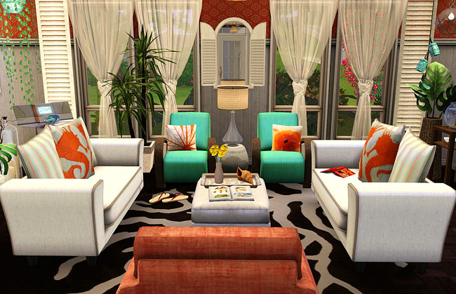
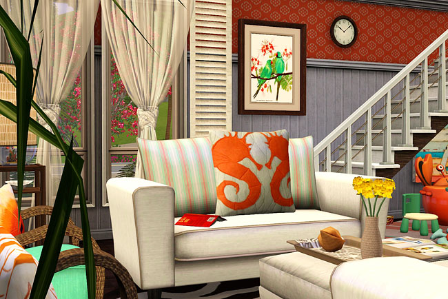
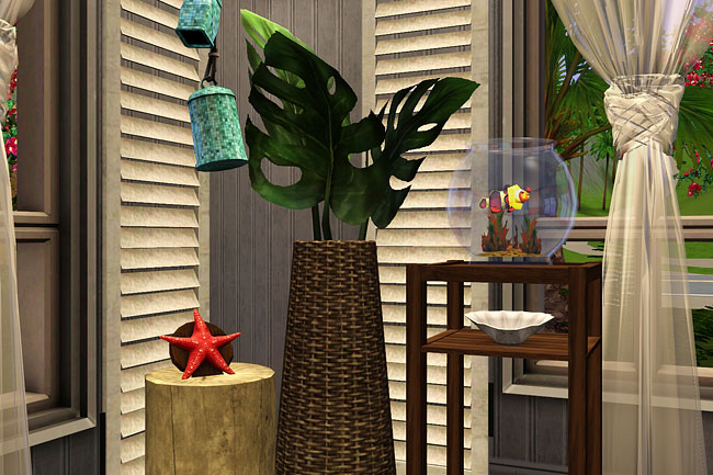
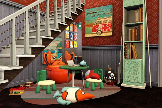
(This one is pretty much the same as the pic I submitted — for some reason I didn’t take very many pics of the play area)
That’s it for now — Happy Simming!
Absolutely FANtasTIc round, Jen – I love that you didn’t go the blues and creams route. You just have to get through to round three with this entry – on the podium too ;0) xx
Heh, thanks, Lily. :) Mine looks so oddball compared to everyone else’s that I wonder if I got it all wrong, but I guess we’ll see what the judges think! I’m having so much fun with the contest I’ll probably finish the house even if I don’t make it past Round 2.
Love it! I also love how you didn’t keep to the classic costal look, it makes your design more individual to the others ive seen on the forum. Oh and you’ve got to love the campervan picture under the stairs because campervans rock :)
LOL, I agree about campervans! I was excited when I found that picture. :)
Love it like always!
Aw, thank you, Hannah!
You are WAY TOO GOOD at this, jenba. :O)
By the way … I can’t get that Triple Trouble link to work.
Yeah, the Living Sims forum can be tough to access lately — I think they’ve got more traffic than they can handle. Sounds like they’re working on the issue, though. If it’s down, I usually try in a minute or so, and then I can get in. :)
Great job :) I’m sure you can get to the next round. How many rounds are there by the way?
Also, are you good at decorating in RL as well? is your decorating taste the same type as what you give your Sims? I like old houses with lots of old clutter, in RL and Sim life. But when it comes to my own apartment, I can’t stand clutter. The less stuff I have the better. Easier to dust.
Thanks, ani_. :) There are 4 rounds total. There were 50 submissions in the first round, and 26 got through to Round 2. They’ll cut it in half again for Round 3. We’ll see what happens!
I’m very much a trial-by-error decorator in the game — I start with a basic idea, usually inspired by pictures or a movie, and then I tweak and change colors and patterns and objects over and over again until it looks good to me. I can spend an hour just deciding what wallpaper pattern and color to use! Whereas in RL, you have to have a fairly complete idea of what the room will look like before you even start, because it can be very costly and/or time-consuming to change it later. So my RL decorating style is very haphazard and fairly dull. A lot of my furniture is hand-me-downs or stuff from IKEA, and there’s no real unifying theme. Except for my office — I ‘designed’ that one from scratch, so it’s not so bad. Anyway, I’m with you on clutter — I can’t stand it, but I seem to end up with too much of it anyway!
I love how different your room is from the other entries I looked at. Everyone else went with blue and white and yours has such a wonderful lively feel to it. I love that you’ve even got a tragiclown fish in there. *giggles*
Okay, more “How did she DO that??” stuff… How did you get useable space under the stairs like that?!?
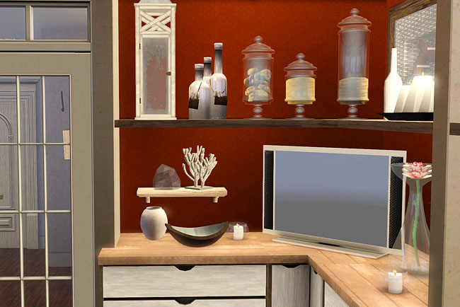
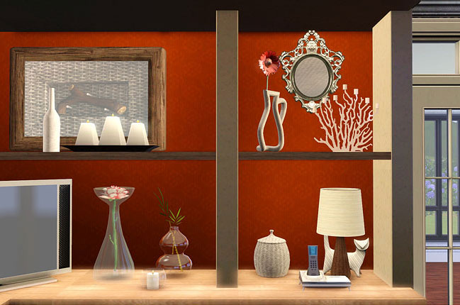
And how did you get the combined counters and shelf thingy? There are clearly a TON of decorating tips I haven’t a clue how to do. *grin*
Even the items you picked to decorate the shelves with are perfect. The white and glass keeps the room from getting to heavy and busy, which it could with the bright tropical colors. :D (Awesome stereo, by the way!!)
I’ve no doubt you’re getting through to round 3, not that I’m biased or anything. ;)
Thank you, Aer! :D Hooray for you noticing the tragiclown fish! A couple of the family members have the Good Sense of Humor trait, so I thought that suited them. Plus it’s the fish that looks the most like Nemo, one of my inspirations for the room. ;)
I’m not sure that space under the stairs is useable, actually. It’s not one of the requirements of the contest to make the rooms playable, so we’re free to place things in weird spots and usually inaccessible areas. So all I needed was a little “moveobjects on”, and [i]voilà [/i]! Playspace under the stairs.
As for the counters/shelves thingy, I had found an inspiration pic of a modern room that had a coral wall with floating shelves on it and then white beachy objects on the shelves. I thought a couple floating shelves on the wall in the contest house would look kind of sparse, plus I needed a place to put the TV, so I tried to make a whole shelving unit. I used kitchen counters, floating shelves, soffits from a kitchen set for the “top” of the unit, and then the Oarsmen’s Column (from base game, I think) for the “sides”. And with “moveobjects on” to place things on top of each other, holding the “alt” key to line things up properly, and alt-slide-y thing to move the shelves up and down, it worked out fairly well. Things look a bit wonky, but I’m happy with the overall effect! I’m glad you like it, too! :)
Well I can’t make any other comments than “What Aer said!” lol
Seriously I am in AWE at your mad decorating skillz. (Bows to the awesomeness that is jenba)
Aw, thank you, Tracy! *blush*